Buildcom
The Buildcom is a construction brand dedicated to simplifying construction needs. I got the opportunity to design the logo of this brand. The Logo I designed, featured a bold and stylized cityscape with a subtle building shape. It symbolizes the brand's connection to tools and equipment.
The concept of this logo centers around creating a modern and professional identity for Buildcom. The stylized cityscape incorporates the essence of construction while reflecting the brand’s reliability and strength. The design captures the core values of positivity, innovation, and energy, aligning with the company's mission to simplify construction processes.
For me, this logo work was pretty much an exciting experiment with shapes and symbols. I focused on creating a clean and versatile design that conveys the brand’s expertise in construction. The incorporation of building shapes highlights the connection to tools and equipment to make it both functional and memorable.

I chose yellow as the primary color for its association with construction tools and equipment. It symbolizes energy, positivity, and reliability. The bold yellow ensures the logo stands out in a competitive industry. It also reflects the brand’s vibrant and dependable identity.
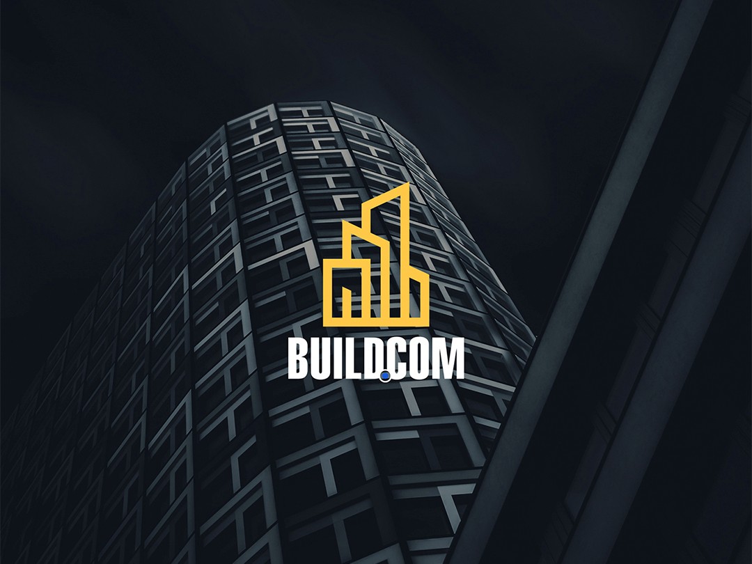
The typography I used has a clean and bold text that complements the logo’s minimalistic design. The font emphasizes clarity and professionalism, ensuring the name Buildcom remains prominent and easy to read. This approach reinforces the brand's focus on trust and efficiency in the construction sector.